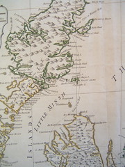
Landscape organizes everything within sight.

Monday, March 29, 2010

The Invisible Frontier: Thrivability Essay, 2010

(the following essay was my contribution to Jean Russell's digital pamphlet, Thrivability, which outlines the pathways to a new economy built upon respect for humans, the value economy, and the environment. Read more about Jean's vision at her blog, Thrivable)

The invisible frontier is the location of the zones where modernity has failed to make good on its promises: famines, wars, corrupt bureaucracies; ghettos without exits. For those who rest content in the faith that capital heals everything, the invisible frontier remains invisible. When confronted with rumors of people on the other side, they characterize those people as monsters : the great unwashed, living in a devil’s playground of arson and gang wars.

The old-fashioned capitalists are wrong about what things look like across the invisible frontier. That way lies information, precious information. The information tells us about modernity’s failures, about government abuses and neglect, about disintegrating markets. A drive through the wrong side of town shows the grocery stores that are closing their doors, the encampments of homeless, the empty factories.
A drive through the Rust Belt shows quick the devastation hidden from coastal enclaves: entire neighborhoods, demolished. Standing skyscrapers, vacant. New empty lots, cleared by arson. Closing schools. Closing hospitals. Abandoned old folks’ homes. No one can afford them. This information is frequently of a kind useful to those who care about the future: it shows how bad the economy is and how much worse it could get. The invisible frontiers show what happens in the breakdown of capitalism and government: they show the societies of hobos, the existence of spontaneous guilds in trailer parks, child-care co-ops, community gardens, and utopian storefronts. The
invisible frontier is the location of experiments that rival capitalism.

In general, invisibility happens because of lack of access to capital, social or otherwise. The son-of-a-preacher public health expert hasn’t walked the back roads of Liverpool and has preconceptions about what the inhabitants need: they need morality before they need running water. The son-of-a-preacher knows who to talk to in parliament; the Liverpudlians do not. Another example: the health-insurance lobbyist
can buy access to the Senator; devoted student activists cannot. People on the other side of the digital divide -- the 12% whom the Pew tells us have not even a dial-up connection -- cannot tell Silicon-Valley engineers to design community-participation software that runs off of cell phones.

Insidiously, however, the invisibility of people is usually mutual. Even if you volunteered to design infrastructure tailored to the people on the other side of the digital divide, they might have a hard time answering the question. The uses of infrastructure are new to a people who lost their houses to highways. Poor factory-workers in nineteenth-century Liverpool choked when they went to Parliament.
They didn’t know which functionary they would speak to, or which language with which they would interact if they found him. A whole host of functionaries have arisen since 1870 with the attention of bridging these gaps: public schools, social workers, outreach centers, organizers, and activists. All of our modern institutions produce a
surfeit of paper. The institutions of freedom -- from Parliament and Congress to the school board to the IRS and the design of the internet -- are shrouded in paper, their inner workings invisible to the people who would benefit the most therefrom.

Landscape invisibility compounds class invisibility. Stockton, a foreclosure capital, is home to Hispanic truck-drivers and factory-workers who have lost their houses in great numbers. They are no different than other, better-known working-class immigrants in San Diego, Chicago, and New York. However, Stockton is off the map. First, the poor lose their landscape; next, they become invisible. Whatever capital has forgotten about dissolves like the soft paper of midcentury paperbacks, crumbling in the hand. On the digital landscape, the overworked and harried rarely contribute to community web2.0 bike-maps. They too become invisible. We keep planning, however, as if there were no frontier, and nothing invisible beyond it.

The truly sustainable, the thrivable designer, reaches hands across the invisible frontier. It reaches across the digital divide, and puts technology for rethinking government, energy, and food directly in the hands of those communities who live in food ghettos (where there are no grocery stores) and dial-up deserts (where one pays
upwards of $40/mo for a slow connection on a pc shared by 5). Thrivable design listens patiently, it enters dialogue with potential users who find the new terms difficult, whose interests and resources and foreign to those who come from a state of capital.

Thrivability recasts the designer's place: no more in the halls of power, hanging out in shiny buildings in well-kept cafes with others of money; now instead, the designer belongs in the city, on public transit, exploring the suburban ghetto. Thrivable design on the invisible frontier pays attention to all those details of life hidden in the landscape -- the public places where strangers meet, the memory of people who have migrated a long way together, the corridors people travel who don't have access to funds.

The thrivable designer sees life -- people trying to make a living, communities that need tools -- where old-fashioned capitalists see only failure. Thrivability recasts the designer's role: no more the paid lieutenant of corporation and state; now, instead, the wanderer around invisible peripheries, the witness and facilitator of emergent states.

Reblog this post [with Zemanta]

Labels: , , , , , , , ,

Thursday, March 11, 2010

Visualizing the Academic Mind

The Social Sciences began experimenting with visualization as early as the 1910s, when Franz Boas applied Kwakiutl place-names to an ordinary map to help him better explain the Kwakiutl world view. In the 1940s, scholars of folklore began abstracting these geographical diagrams into "synoptic diagrams" that showed concepts in relationship to each other. Since that time, scholars around a range of disciplines have used mental maps and synoptic diagrams for their powers at synthesizing a range of information from diverse fields.


James A. Notopoulos, “The Symbolism of the Sun and Light in the Republic of Plato. II,” Classical Philology 39, no. 4 (October 1944): 223-240.


Briefly, visualizations do two things to rational argument that text is very bad at doing.

Synoptic diagrams are excellent at getting people on the same page. For this reason, anthropologists in the 1960s used them to synthesize everything known about cultural binaries, making sure that divergent scholars came to a consensus about the shape of world view. For this reason, too, "visual journalists" were hired in Silicon Valley from the 1970s forward to draw synoptic diagrams of a discussion, live. When everything everyone has said in a meeting appears on the wall, visually organized by the proximity of arguments, the meeting tends towards agreement. With a visual record, it's more difficult to suddenly disagree, reposition oneself from the outside or challenge the record. Visual diagrams lend permanence to thoughts and help to establish universal, structural arrangements, organizing all intellectual manifestations.

Visual diagrams are also particularly useful for ability to pan out. In a text document, it's often hard to get an overview without relying on an arbitrary abstraction like a table of contents. When reading a map, however, the scholar bends over to see more clearly the detail around a particular city, or steps back to see the nation as a whole. Just so, a visual diagram of an argument allows the reader to very quickly slip between the finite details and the big picture -- making sure that the argument fits exactly where it's supposed to.

For both of these reasons, I've found, as a scholar who produces text, that visual diagramming aids both my ability to recall large numbers of facts -- and to organize them into a larger picture without repeating myself.

There's much to be said here, but I'll confine myself to mentioning two of my favorite tools and their uses.

1) PersonalBrain

Key uses:
- Notetaking at conferences/lectures when facts may be needed for later recall
- Organizing facts related to an overview of a broader field
- Brainstorming in a relatively new subject area
- Keeping track of large numbers of dates, characters, and places when these items are new

PersonalBrain is a sovereign organizer of images, notes, and web links -- it allows you to drag and drop URL's, jpg's, and text from your daily reading program into a map. A few keystrokes allow you to type "thoughts," quickly linking "up" to "parent thoughts" -- overarching categories (History of Chicago < History of Cities) -- and "down" to "child thoughts" (History of Chicago > Ship and Sanitary Canal).


PersonalBrain is amazing at making million-thought outlines at conferences. Using it to take notes allows you to, over time, create an extended map of your entire knowledge of things-people-have-told-you-about-the-periphery-of-your-field.

Say I'm listening to presentations at the Anglo-American Conference, and one of them includes a colleague lecturing on balloon housing in the history of Chicago. When I begin taking notes on "Balloon Housing," I link it to the "History of Chicago." PersonalBrain remembers that I have other notes on the History of Chicago, and suddenly, my two sets of ideas are connected. Everything the colleague now tells me about housing and construction is now linked, however distantly, to the larger thoughts, The History of Chicago and the History of Cities. Should I ever need to locate those thoughts again, there they are, linked up with their related subjects.


Over time, these expanding larger categories ("history", "modernity", and "landscape" are key ones in my case) come to be enriched with detailed information garnered from sitting in conferences, job talks, and other lectures.


Five years from now, when I'm suddenly called upon to teach an introduction to Western Civilization, there will be my lecture notes: matching my colleague, his references to Chicago, all the notes I took, and any other notes I happen to take on Chicago after now. Say I'm planning that lecture, and want to recall how Chicago fits into everything else I know about modernity. PersonalBrain allows me to pan back from the single-thought view. It creates a map -- weighting thoughts related to each other so that they float near each other. On a big screen, entire branches of knowledge become clear.

This flexibility and permanence become rapidly useful when you're juggling large numbers of concepts whose relationship to each other is still unclear to you.

A perfect example: rewriting a syllabus. I recently sat down to reconsider the syllabus for a graduate course in Digital History, which I teach at the University of Chicago in Winter 2010-11. The course I teach has three parts -- one, a history of information revolutions since Gutenberg (with readings by Bob Darnton, Adrian Johns, and Ray Kurzweil). Two, an overview of contemporary issues like privacy and copyright (readings by Larry Lessig and Dan Cohen). Three, an introduction to new methods like GIS, network analysis, and collaborative writing.

That's a lot of information to teach. The class only goes clearly if one divides up the syllabus nicely into classes where each meeting offers a small dose of each subject. How to make sure I'm covering my bases? Brainstorming with PersonalBrain helped: I outlined issues and grouped texts together before creating time-oriented thoughts like "Week 1" and dividing them. Take it for a whirl:


Digital History Syllabus
(Hint: the "+" in the menu expands to a more elaborate view; the spider-icon allows you to switch from normal view to expanded view where you start to see the big picture.)


Personal Brain's one weakness for my purposes is that it's not designed to allow you to write in paragraphs. Your "idea" is only allowed to be about 40 or so characters long.

The program is therefore not ideal for writing essays. Thus, the thousand notes on railways i took at the Huntington Library last year: not so great. They're a beautiful outline. They're wonderful to lecture from. I can rearrange them, elaborate them in the "notes" view, and then export them as a text outline. It's very difficult, however, to work sentence-by-sentence through my notes, to make sure that every thought goes in an explanatory order, and that conclusions follow after facts.

Since that visit to the Huntington, I've figured out that a better piece of
software for outlining notes that go into essays is MindManager, a mind-mapping program designed to fit seamlessly into Word.

2) MindManager

Key uses:
- taking notes on a historiography
- taking notes for an essay while moving towards the ultimate structure of the essay

Mindmanager allows you to take notes on a project and move them around in a 3d map
until they make sense. Because the essay view is synoptic, the writer's eye can constantly move back up the tree hierarchy -- to make sure that this thought is in the right place -- and down the tree hierarchy -- to make sure that every statement is thoroughly supported with adequate evidence.

The essay is written as a branching tree. Each sentence and paragraph can be dragged-and-dropped into place; entire sections can be rearranged, with their entire structure intact, into the linear flow of the essay. In this way, the essay's structure is constantly being reorganized for clearer flow.


The writer has the ability to easily zoom in and out of a particular view. As one zooms out, viewing the entire essay as a map, blank spaces of insufficient support become visually clear. That ability alone decreases the chances of convincing oneself that one has adequately supported a point only to remember, when printing the essay out, that insufficient evidence has been cited.

Such tools increase the writer's chances of catching redundancies early, and decrease the likelihood of writing and rewriting the same essay over and over again. A few weeks' work suggests that Mindmanager doubles the writing speed of an average essay, at least.

Once the thoughts are organized in what seems to be their proper shape, sufficiently elaborated, the writer exports to a text document. The visual, hierarchical mindmap instantly becomes a linear essay.


However: MindManager doesn't allow you to make the million-point 3d
map of your own brain. It's marvelous for moving from a visual brainstorming diagram of main points down to support; it's less good at creating permanent ideas in a branching tree of knowledge, giving large ideas permanence, and making connections where none previously existed. For brilliant note-taking at conferences where people are throwing you information you might need to find again in 5 years -- much better to
use Personal Brain.

For my own purposes, I've chosen to adopt both tools for different uses. I use PersonalBrain for taking notes in other people's lectures -- for organizing my knowledge of things of general interest -- and mindmanager for taking notes specific to your own project -- for turning note cards into essays.

Reblog this post [with Zemanta]


Credit where credit is due: Thanks to Jerry Michalski and Cathrine Dam for plugging me in!

Labels: , , , ,